
 Being illiterate was frustrating! In Japan last May, I could not read package labels in grocery stores and pharmacies, follow the directions posted on street maps, or understand the background information displayed on many museum exhibits. Japan’s written language is a complex combination of three different systems, none of them the Latin (sometimes called Roman) alphabet used in written English. I had learned enough spoken Japanese to hold simple conversations during our two week stay, but I had not even attempted to grasp written Japanese. Fortunately, people were helpful when I would awkwardly voice questions, and some of those packages and maps also displayed pictures, reminding me of my favorite all-ages wordless work, Shaun Tan’s The Arrival (2006). Reading is not always or only about recognizing words . . . which brings me to the topic of today’s post.
A new wordless graphic novel, Peter Kuper’s The System (2014) also got me thinking about Tan’s book, and the audiences for such works. It is no surprise to anyone who works with or has kids that preschoolers enjoy picture books whether or not they have words. David Weisner’s award-winning, fantasmagorical Tuesday (1991; 2011) and Bill Thomson’s vivid Chalk (2010) are just two great examples of contemporary wordless books that captivate their targeted audience, young pre-readers. Folks involved with English as second language learners or professionals assessing speech abilities also recognize how useful wordless books can be for many age groups. But fewer people are aware of the wordless novels created specifically for older readers, such as Kuper’s The System—or that these books were some of the modern “grandparents” of today’s graphic novels. So I thought today I would spotlight some of these superficially wordless books. I say superficially wordless because, as renowned author/illustrator Art Spiegelman has noted, “Wordless novels are filled with language, it just resides in the reader’s head rather than on the page.”
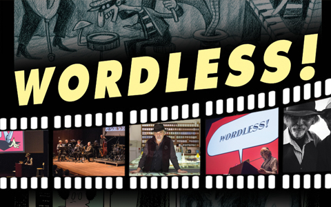
Spiegelman—whose acclaimed graphic family memoir Maus (1991) won the 1992 Pulitzer Prize for literature—is an enormous fan of wordless graphic novels. In fact, he has just completed an international lecture tour, complete with musical accompaniment to his slide show, about the history of these works. How I wish that Minneapolis-St.Paul had hosted one of Spiegelman’s events, advertised under the title “Wordless!” Those of us who couldn’t attend one of these events will just have to be satisfied with the brief segment of his presentation available on line, and the leads he provides there to influential artists of the 1920s through 1950s, such as Flemish Frans Masereel, German Otto Nuckel, and Americans Lynd Ward and Si Lewen. Their graphic novels–such as Lynd Ward’s Gods’ Man (1930;2010), with woodcut images reminiscent of medieval art—deal with adult life and struggles, and will be best appreciated by readers teen and up.
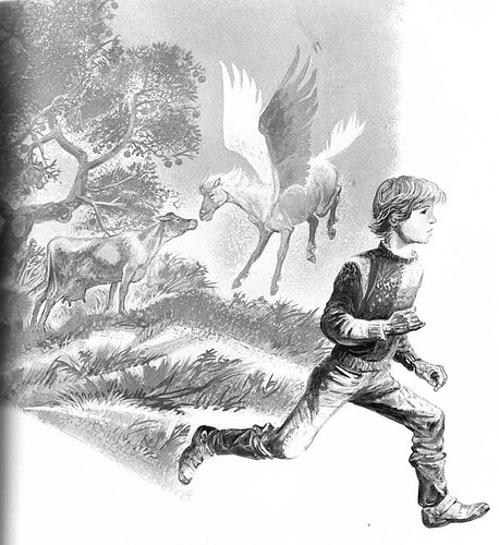
Yet, knowing that Ward (1905 – 1985) had also illustrated and written traditional picture books, I was pleased to discover his one wordless book for kids: The Silver Pony, A Story in Pictures (1973). Its grey-toned pages depicting a Midwestern farm boy’s adventures with a winged pony—whether imagined or fantastically true—will delight not only kids but anyone young at heart. Even though the small family farm Ward envisions is nowadays a vanishing reality, images such as a curious cow confronting that Pegasus are delightfully unforgettable. Ward’s depiction of the boy’s adventures is also an illuminating reminder of how imagination gives all of us wings.
Still, wordless novels written for teens and up are my focus today. Peter Kuper and Erik Drooker are two contemporary author/illustrators who excel in this format. Both are also successful magazine illustrators and—probably not coincidentally, given their shared interests—both worked on the “Wordless Issue,” number 39 of World War III Illustrated, a semi-annual magazine focused on social commentary and journalism. Both Kuper and Drooker are concerned with global issues, yet each also has strong New York City ties, often featured in their work. That is certainly true of Kuper’s The System (2014), explicitly set in New York City, with a darkened NYC subway system map featured on its inside cover, frontispiece, and title page. This powerful, arresting novel–first published in 1995 as three DC comic book issues and then in 1997 in one paperback volume—is as relevant today as it was in the 1990s, even though a few of its NYC locales have undergone dramatic changes. (Times Square is no longer a seedy hangout for illegal or questionable activities, and the Twin Towers are, of course, no more.)
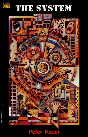
Kuper created the book’s color-saturated pages by the unusual, labor-intensive means of stencil cutting and then spray-painting his images. Their colors sometimes bleed into one another, a visual effect he chose to support his storytelling goal: to see how the lives “of a subway car full of commuters . . . crisscross and impact one another in positive or even catastrophic ways . . . .” It is a great goal, as we wonder and watch in suspense to see how the different story arcs overlap and finally come together. Kuper’s characters are the working poor (including a mother supporting her child by working as a stripper), minor drug dealers, police officers “on the take” as well as overworked detectives, victims of a racist attack, and the homeless. The one suburban, seemingly middle-class character is a man catching the subway at Grand Central Station, travelling in to regularly visit his hospitalized, AIDS-stricken lover. Financial and social success are dubious achievements in this slice-of-life book. The only richly-dressed character is a smuggler of explosives, while images of newspaper and TV news headlines spotlight corrupt officials. In Kuper’s world-view, our current systems—of government, business, and even health care—are failing large numbers of people.
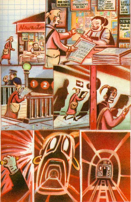
Fragments of newspaper stories, picket signs, a missing person flyer, and a final, ironic sound effect “word balloon” are the other, infrequent verbal cues that sharpen and refine The System’s satisfyingly complex narrative. Kuper also uses three literary epigraphs, each mentioning a “system” or “systems,” that drive home his point. Even without these cues, though, Kuper’s images are strong and clear enough to communicate the novel’s gist.
In The System, one image frequently morphs into another—for instance, a subway entrance transforms into the gaping mouth of a strip club customer. This technique helps readers transition from one story arc’s setting to the next. Kuper also uses this technique to engage us with his characters’ emotions. As the hospital visitor imagines his lover’s death, we see the lover ascending towards the sun, only to have this image transform into the teardrop descending from the grieving visitor’s eye. At the novel’s conclusion, a black window shade is pulled down on one of novel’s happier outcomes, only to turn into underground darkness, the subway tunnel abode of the homeless man who has scavenged a terrifying surprise. Kuper also uses several double page spreads to great dramatic effect and is a master in varying perspective and close-ups with mid and long distance images. Readers who relish irony and tales of urban life and strife will wholeheartedly savor The System.
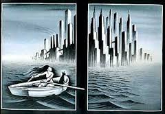
Erik Drooker’s Flood! A Novel in Pictures (1992; 2002) is stunningly good—an intense, semi-autobiographical look at the experience of an urban artist who loses his factory “day job.” He then wanders the bleak streets, subways, and boardwalks of New York City, seeking relief first in sex, then in amusement park side shows and rides before returning to his drawing board. Limited use of color is important in this mainly black-and-white book; it is only in its second half that Drooker adds bright blue to his expressionist images, emphasizing the phantasmagoric nature of his narrator’s experiences. The artist sees an Inuit tale he is illustrating come to life, seems to float above Coney Island’s roller coaster, and “sees” images of the United States’ grasping, harsh treatment of Native Americans, Blacks, and urban protestors. Like the flood that engulfed Biblical Noah’s degraded world, a rising tide covers iconic New York City skyscrapers, but only the artist’s cat—adrift with the shivering artist in a rowboat—finds shelter on a new, post-apocalyptic ark.
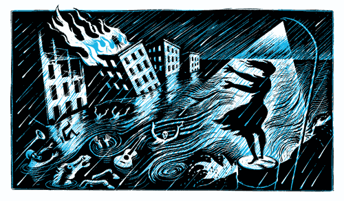
Drooker varies panel size and makes frequent use of double page spreads to communicate the intense, inner reality his book expresses. Its extreme angles and bold, dense images are reminiscent of 1920s and 30s Expressionism and that era’s renderings of “primitive” tribal art. Frequently viewing the skeletal interiors and hearts of Drooker’s characters, we know that Flood! is meant as metaphor, not reality. But the pounding, pulsating intensity and rhythms of this graphic novel make it feel real. In 1994, this work was deservedly honored by other writers with an American Book Award.
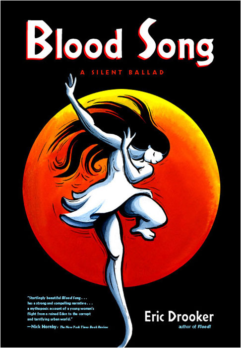
Like Flood!, Drooker’s Bloodsong—A Silent Ballad (2002) limits color on its primarily black-and-blue pages. Drops of red blood and flashes of yellow and orange make only brief appearances on a darting butterfly, in the wail of street music, or the cry of a newborn infant. Unlike Flood, though, Bloodsong is not tied to one, identifiable locale. Its tale of a young woman and her dog fleeing brutal soldiers who ravage their tropical home could take place in many parts of the world. The inhospitable city in which they find refuge is also never identified. Drooker has said that he wanted to create “a fable . . . a fairy tale of sorts” in which his character comes of age as “corporate globalism [is] devouring natural resources and human labor with increasing speed and cruelty.” Drooker visually sets the stage for this haunting, mythic story with images of the Milky Way galaxy that zoom in to images of Earth and later zoom back out. We care about the big-eyed, lithe-limbed girl who is determined to survive, no matter how scared or outnumbered she is. We feel for and with her as she finds a kind lover in the Big City, only to have him unjustly torn from her as they form a new family. By using each double page as a diptych, Drooker moves this story along at a fast pace that leaves us satisfyingly breathless. We want to see what happens next as we turn each page!
Close-ups alternate with more distant views, from varied perspectives, in these water-colored pages drawn with bold, often sinuous scratchboard-etched lines. Drooker believes that “the visual affects us on a different level than the written . . .” that it is “an ancient language.” Readers of Bloodsong will enjoy its eloquence, set to the rhythms of an anti-war, anti-establishment melody.
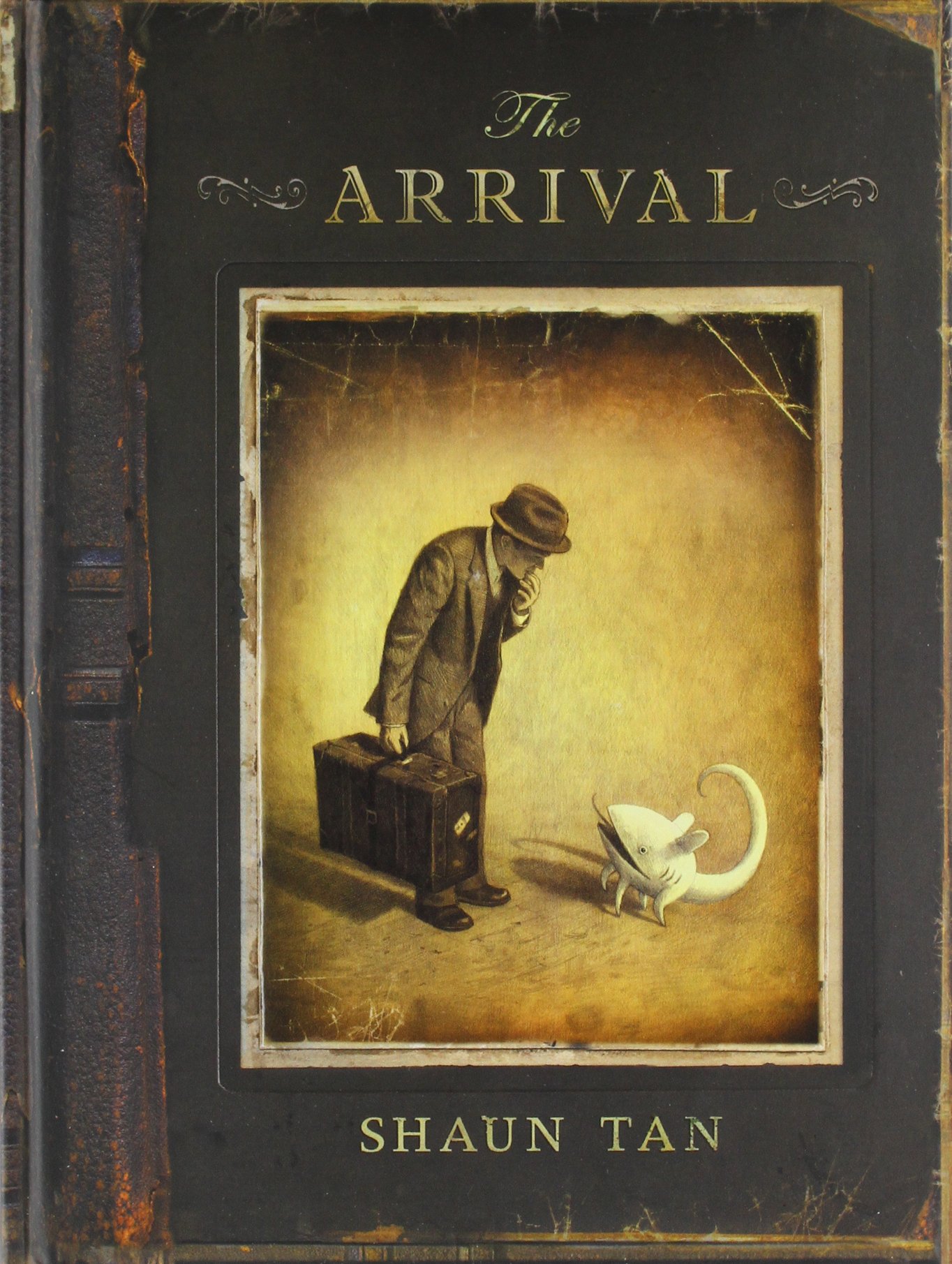
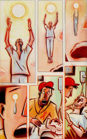
Like Bloodsong, Shaun Tan’s acclaimed The Arrival (2006) is not set in a specific locale. In fact, some details of its cityscapes—such as the shadows of seeming dragons overhead, larger-than- life port statues unlike any Earthly ones, and small, oddly-shaped creatures who mysteriously pop up as useful pets—make its setting a fantastic one. Its sepia tones, akin to old-fashioned photographs, also help set this wordless novel in an alternate, early- industrial time. Yet these strange elements only serve to heighten how universal and down-to-Earth Tan’s story of immigration is—relevant to readers no matter what their own background or current location. Australian Tan, whose end “Artist’s Note” explains that his sources include his own father’s immigration from Malaysia, reinforces this theme of universality through the book’s inside covers, which are filled with sixty passport-like drawings of people with features and clothing from around the globe. Tan’s style of realistically drawing features, communicating different ethnicities as well as rendering emotions clearly, further anchors his whimsical setting in recognizable experience.
![Shaun Tan - The Arrival 112-113[1]](https://natalierosinsky.com/wp-content/uploads/2015/04/shaun-tan-the-arrival-112-1131.jpg)
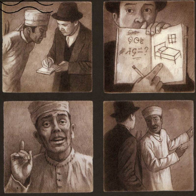
Tan’s main character is a man who leaves his wife and daughter, journeying by sea to a large and distant foreign city. Upon his arrival, the difficulties he has understanding local signs and following written directions are readily apparent to readers because we too cannot decipher the written language Tan has created! At these moments, as I reread this favorite book, I felt as though I were back in Japan, situationally illiterate again. We see Tan’s protagonist fumble in his first job posting flyers, as he unknowingly, humorously positions them upside down. The newly-arrived immigrant uses a notebook filled with pictures to make himself understood and to acquire bits of new-to-him written language. Slowly, he finds other jobs and friends, some themselves former immigrants who describe their own reasons for having left their homelands. Full page and double page images—some dramatizing vast distances or devastating war scenes, others showing the warmth of people who welcome the newly-arrived man—alternate here with pages filled with many small panels. One such page shows the main character, missing his wife and daughter but now employed for some time, as he posts a letter and then awaits a family reunion. Each row of small panels contains a different seasonal plant or item, indicating a year spent waiting until, at last, his family arrives. The novel ends happily with father, mother, and daughter now settled into their new life together. Its final image is of that young girl now helping a brand-new immigrant, suitcase still at hand, to interpret directions on a map that she herself no longer finds bewildering. Tan’s wordless novel will gratify readers of all ages—regardless of which characters they most identify with here.
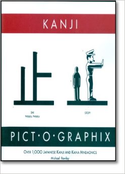 In fact, completing this post, I feel inspired to look at my gift copy of Michael Rowley’s Kanji Pict-O-Graphics (1992). It teaches some basics of written Japanese by associating these symbols with—what else?—the pictured things they resemble. If Shaun Tan’s protagonist can learn to read foreign script . . . . I also am looking forward to the Frans Maaserel and Otto Nuckel wordless novels I have ordered through interlibrary loan. I know, too, that the next time I want to read Franz Kafka’s surreal novel The Metamorphosis, I will seek out Peter Kuper’s graphic adaptation of this classic work.
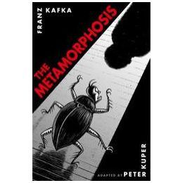
And now that I know that Erik Drooker designed animated sequences for a filmed biography of poet Allen Ginsberg, the 2010 movie taking its title from Ginsberg’s famous poem Howl , I am interested in  seeing that film as well. These sequences are also available in book form, illustrating that title poem. So much to see —and read—that one might almost be (not wordless, never that) but speechless with anticipation.
